Brown Thomas Loyalty App
Android & iOS Apps Designed for Loyalty and Engagement.
My Role
I was the visual and interaction designer, collaborating with 1 UX designer to brainstorm ideas and produce wireframes. We worked with 2 SDK developers and 1 product manager to launch the app to the app stores.
Introduction
Brown Thomas is Ireland's most beautiful lifestyle store, home to an unparalleled range of designer brands. The shopping experience at Brown Thomas thrives to always be a special experience.
Brown Thomas introduced their loyalty card system to reward their loyal customers with treats and experiences. We worked with the Brown Thomas marketing team to update this loyalty experience to a loyalty mobile app, to reward and engage with their customers in a more modernised way.
We were challenged to design the app to reflect the elegance of the existing and highly valued Brown Thomas brand.
Check out the iOS App or Android App.
Problems to Solve
Physical loyalty cards have existed in the retail industry for quite some time. They can connect retail brands with customers and keep track of their spending habits. However, loyalty customers with physical cards are just another number to the retailer. There's a lack of personalisation and meaningful connection between brands and their loyalty card holders.
Physical loyalty cards are a one-way street - they do not allow the customer to connect with the brand, regarding loyalty information and support.
Customers can be unaware of how many loyalty points they have, until they are notified at the till. A loyalty app can put the customer in control for when they want to find out about their loyalty points at any given time. Having more accessible loyalty points information may influence customers to spend more and more often.
Physical loyalty cards can be easy to misplace or lose and it can often be a tedious task of replacing a loyalty card, due to security reasons.
Constraints We Faced
The Brown Thomas loyalty system was an outdated CRM which we needed to integrate with. This introduced some integration difficulties and restraints which caused the development of the app to take a bit longer than we had anticipated.
We worked very closely with the Brown Thomas marketing team to bring this app from an idea, through design, development and to launch. There's many levels of authority within the Brown Thomas marketing team, which sometimes caused delays with sign-offs.
Unfortunately, we were informed that new loyalty customers would not be able to register for a loyalty account through the app - they would still need to register the old way. We recommended that this would be a frictioned and off-putting experience for new loyalty customers, however they chose to discount this as a priority for version 1 of the app.

Market Research
From research conducted with Brown Thomas loyalty customers, very specific outcomes were surfaced which influenced app navigation and hierarchy of content with a strong emphasis on ease of use and updated content.
From a Jobs to Be Done perspective, we realised the jobs of the app were:
Points balance - Customers requested the ability to retrieve their loyalty points balance at any time, straight from their mobile device.
Support - Integrate in-app customer support that allows two way conversations between the company and their app users.
Rich content - Easily create and send relevant rich content to a user's device based on their interests and behaviours.
Different Loyalty Levels
Low-Fidelity Wireframes
As a team, we provided user flows to demonstrate the basic functionality and proposed app structure. We met with the Brown Thomas marketing team on a regular basis, to receive and implement feedback, while discussing recommendations and technical aspects. I collaborated with our team's UX Designer to generate user flows and wireframes, before moving into visual design.
Onboarding Users
We wanted the first impression of the app to match the high quality Brown Thomas shopping experience. We spent a lot of time perfecting the onboarding screens, to demonstrate to customers what the benefits of the loyalty app are and how they can get the most out of the app.
When a user navigates through the onboarding screens (or skips them), they are faced with a step-by-step log in process. Since a big purpose of the loyalty app will be to serve as a communication channel between customers and Brown Thomas, it was very important for us to ask for permissions (iOS) at the right time.
We carefully crafted these permission screens to be informative, so the user understands why they will be asked to opt in to push notifications and location services.
Prototyping & Iterating
As mentioned above, one of the constraints was receiving sign-offs at the different stages of the project from the multiple stakeholders within the Brown Thomas marketing department. This required us to work very closely with their marketing team, holding weekly face to face meetings to present our progress and to discuss any feedback they had.
One particularly helpful meeting was when we first presented an interactive prototype of the app, using InVision. This put the high-fidelity screens in front of the stakeholders and allowed them to interact with the flow we had designed. We gained some insightful feedback before moving into development.
User Testing Findings:
Some button sizes and their hit area sizes needed to be increased.
Some of the stakeholders weren't sure how to use the loyalty card when in store.
The transaction history receipts interaction wasn't the most obvious to some of the stakeholders.
Some of the stakeholders found some difficulty in navigating from other sections back to the home screen.
Solutions to These Insights:
We made the buttons bigger with bigger hit area sizes.
We added a link under the card labeled "how to use" which displayed an overlay when tapped, explaining how to use the digital loyalty card in store. We also re-labeled the card button from "Scan Card" to "Use Card" to make it more obvious.
We included a first-run screen to teach first-time users how to use this swiping navigation. We also included arrow buttons to navigate through the receipts, as a more traditional approach.
We included a home icon in the top right of the nav bar on every other screen, to easily navigate back to the home screen.
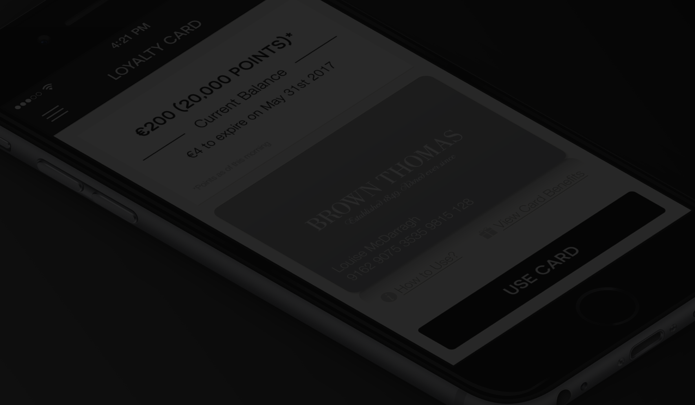
Home Screen - Loyalty Points
When the user successfully logs into the app, they are brought to the home screen - the loyalty points screen. We considered that this screen should be the first screen the user sees when they open the app, to accommodate when the user is about to make a purchase in store and receive their loyalty points. The task of receiving loyalty points through the mobile app needed to be as easy as presenting the physical loyalty card from a customer's wallet.
We chose to include the physical loyalty card as part of our design, as it is a familiar visual for customers when they think of the Brown Thomas loyalty experience and brand.
Depending which loyalty tier level a customer is (Black or Platinum), this was reflected in the colour of the loyalty card displayed on this screen.
With one tap, the user can be informed on how to use their new digital loyalty card and what the loyalty benefits are for them.
Transaction Receipts
To compliment the digital loyalty card and its functionality, we dedicated a section of the app to the user's transaction receipts.
Here, they can swipe through their past transactions over the last 2 months. These digital receipts can be used for refunds and offer a more efficient and useful way for users to keep track of a their spending in store.
We opted for a card swiping interaction to add a fun element to this otherwise pretty basic app section. This approach to transaction receipts and also to the loyalty card section, added a level of skeuomorphism, mimicking these physical real-world experiences.
We included a first-run experience for this section to teach newcomers how to swipe through their digital receipts. A lot of young people will instinctively understand this swiping interaction, thanks to many of today's popular mobile apps that have adopted this as an interaction.
This gesture works really well as a way of browsing through information in a small-screen mobile environment.
Customer Support - Messaging
One of the "Jobs to be Done" was to create an easy to use customer support solution within the app. Using the Pulsate SDK, this solution slotted into the Brown Thomas app and was fully customized to match the branding of Brown Thomas, so it felt like part of the app. It empowered app users to receive Pulsate campaigns to their messaging inbox to keep up to date with Brown Thomas offers and news.
Users could also start a conversation, as easy as sending a text message, when they have an enquiry or wish to send feedback. When a user navigates to the Messages section in the app, they could create a new conversation by tapping the pencil button, decide what the subject is (to help Brown Thomas admins to filter through and manage the incoming messages) and then compose and send their message, within a few taps.
The traditional forms of customer support are still in place for when customers wish to make a phone call or send an email, but this solution integrated right into the app equips users to reach out and receive support in one of the most common ways in today's modern world, through a conversational UI.
Final Design
" Nicely done. Classy as you would expect from a Brown Thomas app! "
Martin Burns - Brown Thomas Customer
Check out the iOS App or Android App.
What I Learned From This Project
As a designer, we are hired to offer our guidance and advice to achieve good user experiences. From working on previous projects and continuing to learn through our career, we offer what we believe to be the best practices and the best design solution, within the existing constraints.
Sometimes, it can prove difficult to work with a diverse team as a client. Different personalities can have different demands and opinions. In order to succeed, everybody involved needs to work as a team and trust each individual with their role in the project.
At the beginning of any project, it's important to clearly define the expectations; business goals, project timeline, budget and who is responsible for what. In this case, it was frustrating for us to learn that new loyalty customers would not be able to register in the app - the first version of the app was for current loyalty card holders only. We expressed that this would be a disappointing experience for new users downloading the app and then learning that they cannot use it. However, due to complications with their current CRM system, the client believed that it was not a priority in the first version of the app. We tried to fight our case but sometimes, you have to accept a defeat and provide the best solution you can in the given circumstances and limitations. At least this was a discovery for us at the beginning of the project, so we and the client were all on the same page for what we would deliver.
Interested in Working Together?
Or you can find me here: