
NYU ALBERT
NYU ALBERT
NYU Info Central Site Redesign
UI/UX Design, Spring 2016
How can NYU Info Central can be improved to be more intuitive and visually compelling?
HOMEPAGE
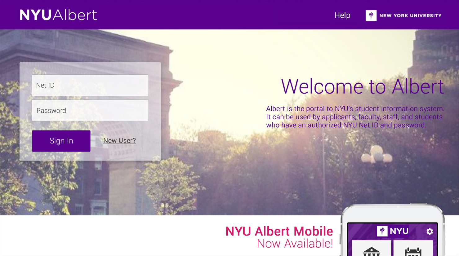
Previous Homepage
NYU Info Central is for the current students and faculties, so most of content are accessible only after login
└─ Make the login box more prominent.
Top-left links are categorized based on user type, but it points to the same log-in page
└─ Show the menu after log-in.
Most of links in the homepage redirects to login page
└─ Get rid of unnecessary & login-required content in the homepage.
NYU wants to promote the Mobile app but it looks like the rest of content
└─ Create a distinguishing visual to promote it clearly
Results
LANDING PAGE
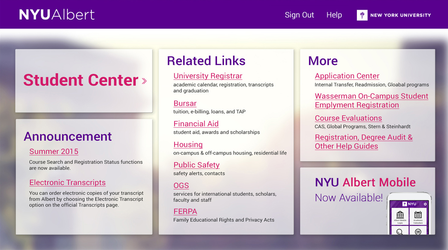
Previous landing page

'Student Center' button in the landing page is hard to recognize as a link, and only shows after scrolling down.
└─ Make the 'Student Center' button more prominent
Page looks scattered and lacks hierarchy
└─ Rearrange category in the order of importance and clean up
Results
PROCESS
1. Rethinking Information Architecture

2. Site Flow

3. UX Redesign
Homepage
Landing page